Original Notes: The Battle of Shiloh took place over the course of April 6 and 7, 1862 in southwestern Tennessee. The two peach colored outer rings of the patch denote the two days of fighting that took place among the various peach orchards located throughout the battlefield.
On the first day, the Confederates made a unexpected strike with the hopes of defeating the Army of Tennessee before further Union forces could arrive. The Union defenders were pushed back during often confused and fierce fighting to a sunken road called the 'Hornet's Nest.' It was here that the most intense fighting occured, and that the Union was able to reorganize and make a several hours long stand, stalling the Confederates until the Army of Ohio arrived on the field the next day, turning the tide of battle in the Union's favor.
As such, a hornet is prominently displayed on the patch, symbolising the peak of the battle that occured at the Hornet's Nest. Behind the hornet is a compass rose, symbolising the focus and direction of Union troops during the height of the engagement. The northern half of the rose is colored blue to denote the Union; the southern half gray for the Confederation. The red ring around the outside of the rose denotes the sacrifice by men on both sides of the battle.
The starfield (taken from the UFP crest) symbolizes the mandate of the U.S.S. Shiloh to explore the stars. Also prominently displayed is the federation logo, symbolizing the space power of the UFP. In the lower right quadrant a 7th fleet logo is proudly displayed to show the addition of the U.S.S. Shiloh to that force.
There have been 5 previous vessels bearing the name Shiloh:
U.S.S. Shiloh, Casco-class Monitor, launched 14 July 1865. The Shiloh was launched to late to see any action and was sold at auction in 1874.
U.S.S. Shiloh, (CG-67) Ticonderoga-class cruiser, launched 8 September 1990. Was deployed to Operation Desert Strike against Iraq, and later to Operation Iraqi Freedom.
U.S.S. Shiloh (NCC-4326) Larson-class destroyer. Launched stardate 1/9009 (23rd century). Later sold at auction.
U.S.S. Shiloh (NCC-74683) Intrepid-class explorer. Initially assigned to the First Fleet, during the Dominion Wars the Shiloh assisted in actions seen with the Twelfth Fleet, primarily near the Cha'ouw and Klingon Empires, as well as Bajor. In early 2377 the Shiloh suffered a warp core breach that resulted in the destruction of the starship.
U.S.S. Shiloh (NCC-74683-A) Prometheus class starship. The Shiloh-A is unique since surviving sections of the mainframe of the previous Shiloh were incorporated into the structure by smelting into the mainframe of her successor during pre-construction.
The three Star Trek versions of the Shiloh are non-canon, but are listed on ST: Expanded Universe and Memory Beta ST lore sites.
Designer's Notes: I made this patch for myself before I was actually accepted as a member of the Lucky 7th. During Open Beta, I was shopping around for a fleet, and the 7th's website was easily the most impressive both graphically and on an organizational level. Although recruiting was closed, I applied anyway (along with an application I put in for the 12th Fleet) and kept my fingers crossed. Oddly, both applications were approved on the same day after OB ended, but the 7th was always my first choice.
The ship patches from this site inspired me. I wasn't sure when, if ever, I would be given an invitation, and I'm pretty good with Photoshop, so I forged ahead and made my own patch. When you know exactly what you want, sometimes it's best to do it yourself. There was plenty of downtime during OB for me to work on it, and I was able to do a lot of research on the Battle of Shiloh, as well as the namesake vessels in existence, both real and fictional.
The patch itself is very loosely based on the ship patch for the USS Shiloh CG-67, seen here:
I took some of the ideas I liked best about that crest and incorporated them with some other ideas I had and I think the result came out pretty well. I love how it looks, and all the various parts of it have a symbolic meaning.
Retouch Notes: The new PC is up and running. And OMG, the graphics card we bought for them are nothing short of amazing. STO has been giving me a bit of trouble, but photoshop hasn't. I spent some time this morning retouching my own patch, and it's finished:
I redid the 'textures' on both the Federation symbol and the 7th logo so that the brushed metal appearance was in line with the outer brushed metal ring. Shrank the Fed symbol down 25% and added Peach gradient to the '7' to also match the outer peach rings, and fixed an imperfection in one of the hornet's wings. Finally, added an outer black border to the piece.
Will retouch Event Horizon and continue brainstorming and production on the Mackinaw this week.
Last edited by sparrow794 on 07/21/14 1:43; edited 12 times in total
Designer Notes: I ended up 'stealing' this patch from Mr. Turner before we had established a method of determining how to avoid duplication of effort. I just know I had been asked to help; so I picked one from his thread that was far enough down the list I didn't think he would be working on, and started putting it together.
I also started working on this patch before I knew what the format needed to be for the ship store. This unfortunately led to my having to push it through 2 major reworks until the quality level was up to what I felt it needed to be.
Sebastian left most of the design details up to us. His only specifications were red and black for the colors; his motto; and possibly having the 7th insignia look as if it were spiraling into a black hole.
2 out of 3 isn't bad. I think my favorite part is the metallic wings coming off of the insignia. They were 'lifted' from a rejected logo designed to represent the recovery act (stimulus package).
As good as circular patches look, having something to break it up adds a uniqueness to the piece.
Retouch Notes: I went ahead and did my 2nd and final reworking of the Event Horizon patch this afternoon. I've been dreading it, to be honest, but it needed to be done. The patch as it had been released looked fine on your computer screen, but inside photoshop at the size needed for cafepress, it looked godawful.
I essentially had to rebuild it from scratch. Better. Stronger. Faster. Or something.
The most easily discernable change is the contrast increase on the patch's main background. The outer rings have been smoothed, and the 7th logo and wings were entirely redone with the aim of increasing the visual quality of any products that may be ordered through the store. When these things get blown up so that they fit onto the back of your t-shirt or onto a wall clock, imperfections are magnified; the whole point of the retouch was to eliminate those issues on this patch. Otherwise, the overall design of the patch remains the same.
Last edited by sparrow794 on 09/09/11 15:33; edited 7 times in total
Designers Notes: Jessica St. Peter had an extremely good idea in mind of what she wanted for her patch. In fact, she had a very rough draft laid out, along with links to various images and design aspects she wanted to incorporate into the patch. I was able to go through several stages, presenting my drafts and getting feedback on what she wanted it to end up looking like, and the final result is quite striking.
I got lucky with this one; I was able to track down a large size Griever symbol that I could easily manipulate and add the two tone brushed metal on black. For the background I stuck with the storm theme from the motto and threw in some dark clouds. Overall though, it's St. Peter's design, I just polished it up and made it look nice
Last edited by sparrow794 on 09/09/11 15:34; edited 4 times in total
Designers Notes: The Mackinaw is based on a Coast Guard Icebreaker. Xivim indicated his theme was keeping this great cutter alive in space, and that he was preferential to the colors red and white.
To pay homage to the current Mackinaw, this patch is designed to be a 'futuristic' Star Trek version of the actual USCGG Mackinaw's patch:
I made the chains on the patch appear to be made out of ice as a sort of symbolic gesture to the role of the real life cutter. In place of the CG cutter is a silhoutte of a vanguard class starship on a snowy background; above which is the operating environment of the starship - space. I took the liberty of emblazoning a bold 7th fleet symbol on top of a marbled federation insignia with a blue-green brushed metal border. Lucky 7 diamonds replace the buoys.
This was also my first attempt to emulate some of Mr. Turner's design techniques by using a faux stitching on the red areas of the patch design.
Last edited by sparrow794 on 09/01/13 3:29; edited 5 times in total
Designer's Notes: Mr. Shadow wanted to base his patch off of the Washington Army National Gaurd 66th Theater Aviation Command "Falcons." He specifically pointed me to this insignia:
He wanted to keep the motto from that crest, and incorporate their colors as well:
Beyond that, he asked for some symbolism representing the great city of Seattle, the space needle in particular.
I felt this would be a good chance to get away from doing circular patches; and looking at both the crest and patch for the 66th, obviously the Falcon plays a pretty prominent role. Figures that to represent Army aviation I ended up choosing an Air Force shaped badge and a falcon...
I ended up substituting the Orange color with a gold texture; I initially had the ribbon at the bottom of the patch as the requested orange. I felt the gold was ... close, it looked sharp, and it ended up tying in with certain parts of the falcon I was putting together.
The main focus of the badge is the falcon, I found a really nice handdrawn one and touched it up quite a bit before adding the color to it. Below it is a silhoutte of what is hopefully recognizable as the Seattle skyline, space needle included. I opted not to include Mt. Ranier anywhere on the patch for simplicity's sake, there just wasn't going to be much room with the giant falcon hogging most of the space.
Added the badge motto and the 7th fleet symbol in marble - along with what is my favorite part of the patch - a lucky 7 diamond on the falcons dogtag.
Last edited by sparrow794 on 09/01/13 3:31; edited 6 times in total
Designer Notes: Having been recently assigned to TF-79 as XO during a fleet restructure, I had a few conversations with Mr. Randle, the 79th's CO, about what direction he wanted to go with for 79's role in the fleet. He chose PvP; a decision I supported. Ultimately it led to discussions on a TF motto and possibly altering the 79th's crest.
I suggested the motto used by The Black Watch, 3rd Battalion, Royal Regiment of Scotland: Nemo Me Impune Lacessit (no man provokes me with impunity). With Mr. Randle's approval I fashioned a crest based around The Black Watch. The lion heraldry is taken from their crest:
The background is the Regiment's tartan (kilt pattern). After that all that needed to go on it was the TF designation, fleet designation, and motto.
Last edited by sparrow794 on 09/09/11 15:37; edited 5 times in total
Designer's Notes: Mr. Vrox's request was very simple; base a patch off the following logo for West Virginia University:
He asked that I keep the color scheme and mountaineer, but lose the giant WV. He also supplied me with a motto, "Montani Semper Liberi," which happens to be the state motto for West Virginia. Translated it means "Mountaineers are Always Free."
I wanted to keep the patch clean and simple as the logo I was given, and took the opportunity to include a lot more 'stitch' work in the design to make it look a little more like a real patch. In place of the WV I substituted a balance between an outline of the state of West Virginia and a 7th Fleet crest. The mountaineer came out nicely and I think the patch looks good, nice and simple design.
Last edited by sparrow794 on 09/01/13 3:32; edited 5 times in total
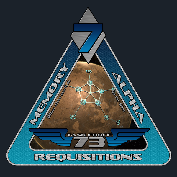
Designer's Notes: Mr. Mercer's initial request was very specific, which is something of a double edged sword. On the one hand, it tells me exactly what is wanted, which can greatly simplify my overall task. On the other hand, sometimes trying to find or create that specific image being requested can be exceedingly difficult.
Most of the backgrounds I use on these patches are from artwork I find on the net. I am not an artist. While saying that my patches are cut and paste jobs is oversimplifying things, in essence, that is what they are.
Mr. Mercer wanted a triangular patch, prominently blue in color, with a picture of a 'kit' being worn on a silhoutted body shape holding a tetryon rifle. He also supplied me with the mottos to be used and exactly where to put them on the triangle.
I had, for a little over a week, tried using various screenshots of my own character wearing different kits and holding the rifle requested. But extracting what I needed for the patch from the screenshots wasn't easy, and they never came out to my own personal satisfaction. They just looked a little too rough and weren't up to the standards people expect from our designers.
So, I started from the opposite side; putting together the patch with all the elements wanted sans background image. Building the patch skeleton was easier than I had expected but I was still stuck trying to figure out how to get a background image that would fulfill the request. In the end, the image I needed was already saved onto my hard drive. I was looking through them when I came across it and thought what the hell, it might work. While she isn't holding a rifle, it still looks like she is wearing a kit (and not much else... HOO-AH), there was a lot of blue in it, and for chrissakes, the top she's wearing even had the number 7 on it:
The artist's name is Fredy Wenzel, and he does some amazing work.
I showed Mr. Mercer the draft, along with two others I had made that had simple outer space backgrounds and asked him to pick one... he went straight for the hot chick, and I don't reckon I blame him.
Unfortunately I have had to revise this patch due to copyright concerns. The revised version, showing a shot of Memory Alpha, is below:
Last edited by sparrow794 on 07/21/14 1:46; edited 7 times in total
Designer's Notes: Mr. Kelly requested his patch include the following image:
He had also asked that I include a red haired woman on the patch (he had initially asked for her to be riding the cerebrus)... As much as we all love patches with hot chicks on them, I ultimately could not fit it in with what I had going on.
The Kusanagi, in true historical terms, is essentially the Japanese version of Excalibur. A mythical sword that grants divine power to the throne - it is one of three pieces of the Imperial Regalia of Japan.
I've always been a big fan of history, military in particular, and WWII is obviously expansive and well documented. The Rising Sun is an iconic image tied to Imperial Japan, and while the 'real' Kusanagi is not necessarily a katana, the katana is the Japanese sword. Blending these images together and including the cerebrus to represent the ship itself resulted in what I feel is a very striking patch:
I sincerely hope no one finds offense with my use of the Rising Sun, as it does represent something of a terrible time not only for the United States and its Pacific allies, but the world in general... I debated whether or not to include it, but ultimately it is an unmistakable symbol of Imperial Japan.
Last edited by sparrow794 on 09/01/13 3:36; edited 4 times in total
Designer Notes: The Leyte Gulf patch is loosely modeled after the current U.S.S. Leyte Gulf patch:
The downward wings represent the kamikaze attacks that took place during the battle. The upright sword is a double homage to the current role of the U.S.S. Leyte Gulf's as an Aegis cruiser, and to the defense against the kamikazes from the battle.
The three stars represent the three component Battles of Leyte Gulf: Surigao Straits, Samar, and Cape Engano. The outer wreath is indicative of the victory won by American forces at the battle.
Fleet 7 insignia is boldly attached against a space scene to finish off the 'Star Trek' look.
Last edited by sparrow794 on 07/21/14 1:49; edited 5 times in total
Designer's Notes: Mr. Greenhaven requested a patch for the newly created Kinkaid Research Station after he was placed in command of it. His initial request was just for a patch and to do whatever I liked; though he later amended it, asking for any possible reference to the namesake, Thomas Kinkaid, and possibly a shot of what the station might look like.
I did some research on Kinkaid and searched around for photos that might be suitable, but unfortunately ran into a brick wall where that was concerned. So I switched gears and decided to focus on the purpose of the Station; namely, science - specifically as it would pertain to weapons research. A clear symbol immediately came to mind. If one thing represents the science of weapons development, it's the atom.
I found a nice representation of one, slapped a '7' on it, and put it against a fractal background (representative of mathematics). I wasn't sure what initial shape I wanted for the patch, and experimented with a few different ones, ultimately choosing the diamond. A four sided patch just made sense and could be interpreted in a variety of ways... each side representing one of the recognized forces at work in the universe, or states of matter, or even the four earthly elements.
I was also able to find a nice shot of a Regula Class station, an iconic Star Trek research station, and squeezed it into a Fed logo.
I didn't have a motto at first, Mr. Greenhaven had not supplied one. But, I woke up from a short nap after having worked on the patch for several hours and the words just popped into my head. I don't remember where I initially heard the phrase; I want to say it was Reagan, but I honestly don't know. In any case, it seemed fitting.
Last edited by sparrow794 on 09/09/11 15:39; edited 2 times in total
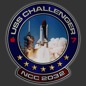
Designer's Notes: A strange request in the middle of the night...
Mr. Talbot pops into my comm channel and asks if I will make him a patch.
"Is there anything wrong with the patch you have now?" ... No, he says.
"Is there something in particular you would like to see on a new patch?" ... No, he says.
He goes on to say he simply wants me to make him a patch with my usual 'flair' if for no other reason than to see what I come up with.
Well, this puts me in a bit of a pickle. I do not want to step on Mr. Turner's toes, nor do I want to refuse a request from Mr. Talbot. They both outrank me. A lot.
There is a distinct difference between the patches I make, and those Mr. Turner makes. The patches I make look good. The patches Mr. Turner make look professional.
Here is the original Challenger patch:
Now, it's important to note that if Mr. Talbot had asked me for a patch, and this one had not been done already, I probably would've gone in a similar direction as Mr. Turner, and likely not done half as good of a job.
But, I was free to do anything, so I attempted to reflect what I knew of Mr. Talbot's personality. He is a softspoken, kind man; but underneath it all you get the sense that he is capable of that 'get off my lawn' demeanor if you do something he takes exception to. He has also probably killed a lion with his bare hands. He likes to play cards. He is a Major General in the Marine Division. This is certainly enough to go on.
I chose Black and Dark Green for my base colors to represent the MD, along with the crossed 'chrome' sabers (another common Marine symbol) tied into the '7'. The background image is an armored space marine with a mean looking weapon and a look in his eyes that says the last guy wasn't so lucky - as you can see by the bullet spray in the glass behind him. The marine shown isn't lucky, but you would have to be to take him down... and of course, the 'Feelin Lucky?' quote ties in with the 'get off my lawn' Eastwood attitude and into the card playing, which brings you around to the spades. Top suite in the deck, sometimes a symbol of death in war, a gambler's symbol.
It's difficult to see in the patch at the 600x600 size, but scrawled across the armor is written "Once a Marine, Always a Marine."
I just thought everything came together very nicely and I really like the way this one came out.
Last edited by sparrow794 on 07/21/14 1:49; edited 4 times in total
Designer's Notes: Much like his initial patch, the design is completely St. Peter's. The shot of the ship is from an in game screenshot; which is something I probably won't do for anyone else, considering how my workload in the art department is piling up. Extracting the ship from the background in the screenshot was fairly painstaking and had to be done almost literally pixel by pixel. Even with the amount of time I put into extracting it, it didn't come out entirely perfect - but that's probably just me being to hard on myself.
Other than the change from the griever symbol to the ship image, not much else was changed. The background storm image was switched from a blue-black hue to simple grayscale, the motto and NX designation shuffled a bit, but overall the patch is fairly similar to the origina Rafale patch.
This was done at St. Peter's request for his RP storyline; the original Rafale is slated for destruction at some point in the plot. I'd actually been sitting on this patch for a couple of months, but he said it was ok to go ahead and release it prior to the story being completed.
Last edited by sparrow794 on 09/09/11 15:41; edited 2 times in total
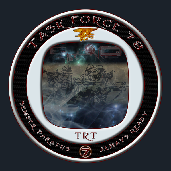
Designer's Notes: I worked very closely with Mr. Scott on this design; he had a fairly specific idea of what he wanted it to look like; including color scheme, shape, symbolism, and so forth. He even went to the extreme of sitting with me in vent one evening scavenging across the internet for suitable images to be utilized as the focus; we eventually settled on the 3 soldiers in addition to a different image (not seen in the patch) that had a group of soldiers coming out of a smoky battleground scene.
Since I wasn't able to use the second image, I decided to try and add my own layer of smoke to the first picture.
His requested color scheme was black, red, and silver - but you'd be surprised how hard it is to make something look 'silver' in photoshop. Usually it just ends up looking like a pisspoor grey.
The motto is taken from the U.S. Coast Guard, though the logo and main image are of Navy Seals. A sort of mix of rescue teams and elite soldiers utilized here to symbolize 7th Fleets Tactical Response Team.
All in all this was possibly the most challenging patch I have yet produced; I had to use every trick I know to make it come out looking top notch. And, so far, of all the patches I have made, this is easily one of my favorites.
Last edited by sparrow794 on 07/21/14 1:50; edited 4 times in total
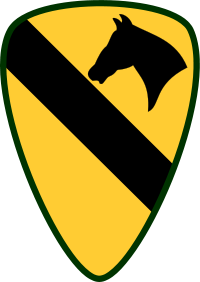
Designer's Notes: Mr. Lang relayed a patch request for Mr. Tillis and asked for it be based off of the insignia for the U.S. 1st Cavalry Division:
A highly recognizable and well known patch. I didn't want to change it too much; just spruce it up, but sometimes even the simplest things can be more complicated than they appear.
I probably sat and stared at the thing for two or three hours just trying to figure out how to change it without really changing it. Ultimately I found a replacement horse head that looked much nicer; put a 7th fleet insignia in the open lower half of the patch, then spent another hour or so staring at it trying to figure out where to put the text. It seems obvious now, but for a bit there I couldn't make it work...
I used a burlap texture for the yellow areas and bevelled out the black sections; adding an overhead spotlight to the entire thing to give it a bit of a regal feel. After much more futzing around than you would think, the result came out pretty sharp:
Last edited by sparrow794 on 07/21/14 1:51; edited 3 times in total
All times are GMT - 5 Hours Goto page 1, 2, 3, 4Next
Page 1 of 4
You cannot post new topics in this forum You cannot reply to topics in this forum You cannot edit your posts in this forum You cannot delete your posts in this forum You cannot vote in polls in this forum